It was about a year ago that we embarked on the same journey - Rohje and I. I instantly knew that our collaboration would go smoothly and that this project of ours would turn outto be something I would never forget. The outcome of our journey together is now finally out there and available for everyone - the Artister watch collection was launched in January 2021. It has been a great honour to be part of the success story of this Finnish watch brand, Rohje. I wanted to share this journey with you and give you some more details about the background of this project. But first, a few facts about me.

Who is Noora Svärd?
I'm a creative multitalent with a passion for art and painting from Kuopio, Finland. Being an artist is an inherent part of me, and over the years, artistic expression has become a secondary occupation I truly cherish. My goal is to create art that brings joy for years and years to come. Having the chance to create a painting that gives hope, reminds someone of a place they love or brings back memories of how they got through difficult times is an immense honour for me. Every single time, it makes me beyond happy to have that privilege. Each piece of art is a valuable process for me and I throw myself into it body and soul. For me, painting is a process of spiritual growth, and my work exudes layers of several colours, which are also present in the watch collection I designed.
Design of the Artister watch model
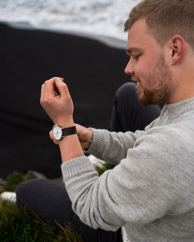
I was essentially given free rein to design the watch. I read a lot about watches and their usability and I familiarised myself with different watch collections and packaging. From day one, my idea was to make art part of the watch, in other words, create a dial that would be a piece of art. In the early days of the project, I discovered that designing a watch involves a variety of aspects that need to be taken into account. To start with, there were many options to choose from when designing the visual details of the watch. These included, say, the strap (reindeer leather strap and metallic mesh bracelet), the shade of the case, the hands, the lines, the numbers, the logo, the background, the crown and the strap lugs. Adding packaging design on top of designing these details made the project all the more interesting. We met for the first time in Tampere in November 2020, when I also got to see the prototypes of the watches. I'll never forget the feeling when I first got to see the concrete results of my design and put the watch on my wrist. Of course, the prototypes still needed fine-tuning, but the idea with them was to see and explore various options. The final collection is a combination of the best features of these prototypes. I also participated in the photoshoot for the watch collection in Helsinki. The results of the work by this highly skilled team are featured in every ad for the Artister watch collection. Perfect, I would say.

The making of Dreamy and Into the Blue
My style of painting is very versatile. I like to explore various techniques, and my paintings are not limited to just one specific style or colour scheme. There is one technique that I use again and again in my pieces: the palette knife technique. My paintings have multiple layers, making the surface vibrant and three-dimensional. When designing the watch collection, I went for swirls or waves that match the shape of the dial. Pink is a colour that has accompanied me throughout my life, that is, since I started painting. However, from bright fuchsia pink I've moved to a slightly more subtle version. "Dreamy" is a blend of various shades of pink, white and grey. It combines a soft haziness and several layers of colour. When I was designing the watch collection, I was also working on a series of blue paintings and that sparked the idea for the dark blue "Into the Blue", which is more intense than Dreamy. I used classic shades of blue and added some blue-grey to mute some of the brightness. This gave the piece its intense blue colour and you can also distinguish a deep swirl, which depicts your journey towards your dreams.
Art as part of a watch
I created different paintings and had a few test versions made. These two pieces soon stood out from the rest. The test group, we and our followers alike took an instant liking to the pink "Dreamy". To our surprise, the blue "Into the Blue" became as popular as the pink delight. To make the collection shine, this duo needed to be accompanied by some simple beauty. As the watch collection is primarily designed for women, Classic emerged as the third star with its classic features, black and rose gold.
One thing I was delighted about in our collaboration was that we both shared the same values and thought the same way - dreams are meant to be fulfilled. This is what also sparked the idea for this watch collection - the courage to pursue one's dreams. We, a bunch of hard-working entrepreneurial spirits, who believe nothing is impossible, joined forces and made Artister happen.